
"In modern dentistry, patients equate a high-tech website with pain-free treatment."
Dental websites often fall into two traps: they are either too clinical and scary (close-ups of tools) or too generic (stock photos of apples). They fail to address the #1 barrier to patient entry: Anxiety.
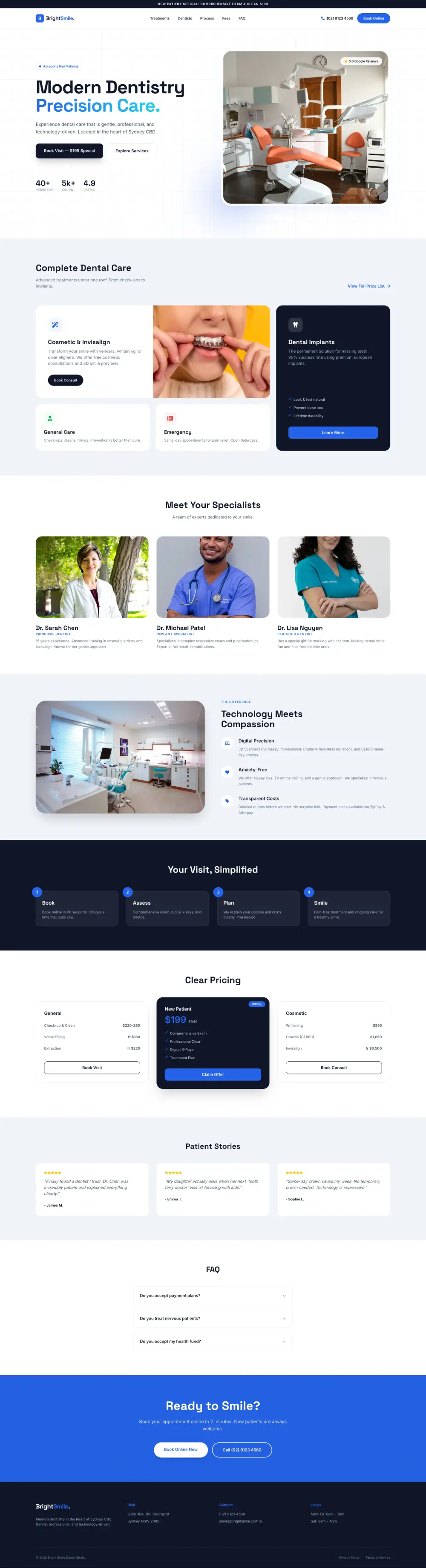
When designing the new Bright Smile Dental Studio, we had to bridge a gap. The site needed to look like a high-end medical facility while feeling as welcoming as a consumer brand.
Your digital presence sets the expectation for the physical experience. If your website is slow and outdated, patients assume your equipment is too. Here is how we engineered a solution.
1. The Aesthetic: Clinical Precision Meets Modern Tech
We deliberately moved away from the soft "Spa" vibes common in cosmetic dentistry. Instead, we aimed for a sharper, cleaner look.
The "Tech-Forward" Palette
Electric Blue
#2563EB. Represents technology, hygiene, and trust.
Cool Silver
#F1F5F9. Adds a premium, sterile (in a good way) feel.
Typography: We chose Space Grotesk. It is geometric and engineered, subtly signaling to the patient that the dentist uses precision equipment like 3D scanners and CEREC machines.
Visual Storytelling: Our photography strategy focused purely on the result (the confident smile), never the process (the dental chair). This psychological shift reduces immediate bounce rates from anxious patients.
2. Reducing Anxiety Through Transparency (UX)
Fear of the unknown (and the bill) stops patients from booking. We used UX design to dismantle these fears.
-
The Pricing Grid
Most dentists hide prices. We designed a clear comparison of "General" vs "Cosmetic" costs. This transparency tells the user: "We are honest professionals."
-
The 5-Step Process
We visualized the patient journey: Book -> Assess -> Plan -> Treat -> Maintain. Breaking the visit down into simple, circular steps removes the fear of the unknown.
3. Designing for the Australian Market (GEO)
To rank in Sydney, a website must speak the local language. We integrated specific Australian dental terminology that generic templates miss.
The Local Ecosystem
We anchored the clinic to the Sydney market using these key signals:
Health Funds: Prominent "All Health Funds Accepted" badges.
HICAPS Integration: Assuring patients they can claim on the spot.
Payment Plans: Afterpay and ZipPay logos for cosmetic treatments.
Location Context: "Sydney CBD" & "Near Town Hall" in the footer.
4. Interactive Elements that Convert
Static pages don't sell high-ticket veneers. We used interaction to engage users.
The Hover Reveal: On the "Cosmetic & Invisalign" cards, hovering reveals the before/after results. This active participation engages users interested in aesthetic improvements.
The Sticky Header: The "Book Online" button is persistent. With 60% of dental appointments booked via mobile, capturing impulse bookings is critical.
Alpine.js FAQ: We used accordions to hide complex medical info (like Root Canals) until the user wants to read it. This keeps the page clean and approachable.
5. Mobile-First Patient Experience
Consider the scenario: A patient has a toothache at work. They are on their phone, in pain, and need a number in under 3 seconds.
We designed the "Thumb-Zone" Menu. It is a full-screen overlay that prioritizes the "Emergency Contact" and "Book Now" buttons, placing them exactly where the thumb naturally rests. Coupled with lightning-fast load times via Tailwind CSS, the site captures the lead before the patient gets frustrated and clicks "Back."
Conclusion: Your Virtual Waiting Room
Before a patient sits in your chair, they sit on your website. It is your virtual waiting room.
If your digital presence is cluttered, slow, or confusing, you are losing patients to the clinic down the road that looks modern, transparent, and pain-free.
Is your practice’s website driving new patients away? Let’s fix that.
Book Marketing Audit →
