
"To sell energy independence, you don't design a flyer; you design a monolith."
The Australian solar industry has a branding problem. Most websites look identical: cluttered, overly orange, and focused entirely on "cheap rebates." They feel like discount electronics retailers, not engineering firms.
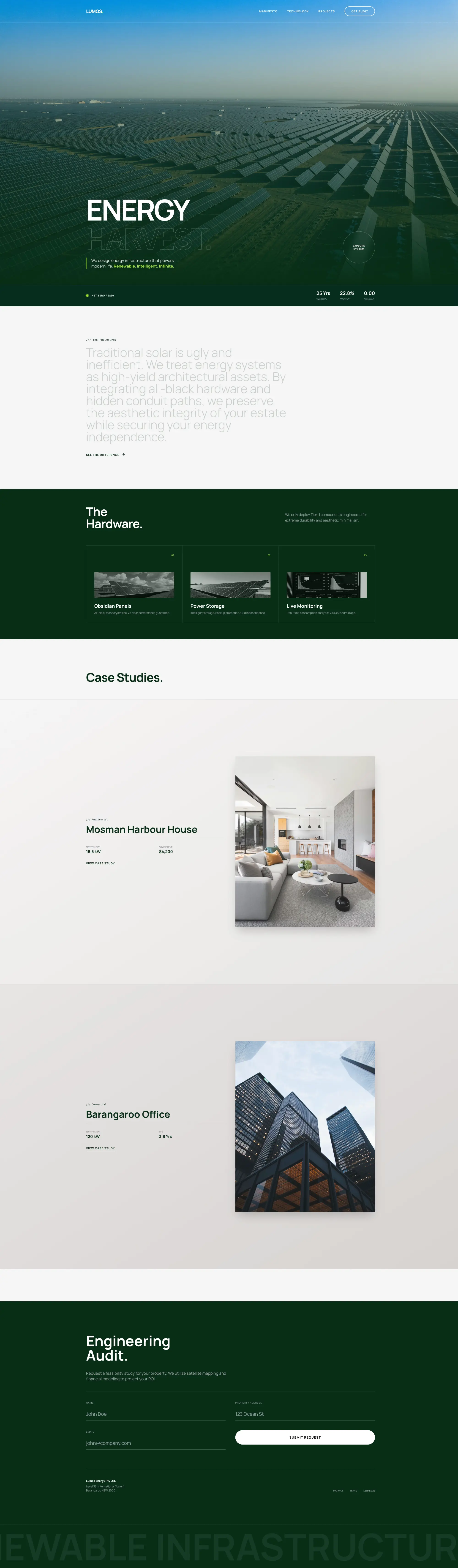
When LUMOS Energy approached us, they had a different challenge. They weren't selling $3,000 budget systems; they were selling $25,000+ Tesla Powerwall integrations to clients in Mosman, Toorak, and Barangaroo.
Our solution was LUMOS v5.0—a digital experience that feels less like a utility provider and more like a luxury automotive brand. Here is how we engineered it.
1. The "Monolith" Aesthetic: A New Visual Language
We immediately stripped away the standard "tech blue" and "warning sign yellow" common in the industry.
The Palette of Power
Deep Forest Green
#052e16. Signals nature and carbon neutrality, but retains the premium weight of a dark mode UI.
Acid Lime
#a3e635. Used sparingly as a "digital pulse." Represents active energy and efficiency.
Typography: We utilized Manrope, a variable sans-serif font. Its geometric precision builds trust through mathematical clarity, essential for an engineering-focused brand.
2. Engineering the "Cinematic" User Experience
High-ticket sales require emotion. We shifted the UX from "Informational" to "Cinematic."
-
The Hero Section
We replaced the standard "smiling family on a couch" photo with a vast, drone-shot image of solar infrastructure. We are selling the scale and power of the network, not just panels on a roof.
-
The Narrative Scroll
In the Manifesto section, we used a word-by-word text reveal triggered by scroll. This forces the user to slow down and read the philosophy, creating a rhythm similar to reading a high-end magazine.
-
Alive, Always
We moved from "Hover Effects" to "Auto-Play." Marquees scroll and buttons float gently even when idle. The site mimics an active power grid—it is always working.
3. Technical Deep Dive: The Invisible Code
Luxury design fails if it lags. We aimed for a 60FPS standard across all devices.
Dynamic Navigation: The sticky header posed a challenge against changing background colours. We utilized the `IntersectionObserver` API to flip the logo and text colour from White to Dark Green instantly as the user scrolls over different sections, ensuring accessibility without breaking the aesthetic.
Tailwind CSS: By using utility classes, we kept the CSS bundle size minimal, ensuring the "Page Loader" (a pulsing LUMOS logo) transitions into the main content seamlessly, without a "Flash of Unstyled Content" (FOUC).
4. Building Trust in the Australian Market (GEO)
Trust signals in the energy sector are specific. A generic "5-Star Service" badge isn't enough.
The Trust Ecosystem
We anchored the brand to local reality using specific GEO strategies:
CEC Accredited Retailer: The gold standard for Australian solar.
"Net Zero Ready": A pulsing indicator promoting future-proofing.
Sydney /// Melbourne: Listing specific engineering hubs in the footer.
25-Year Performance Warranty: Front and center in the UI.
5. Mobile-First Engineering
Renewable energy data is complex. Showing battery load charts and grid stats on a mobile screen is difficult.
We solved this by converting the 12-column desktop grid into a "Stacked Card" system for mobile. Furthermore, we designed a Full-Screen Mobile Menu. Instead of a tiny drop-down, the menu takes over the screen with high-contrast type, offering an immersive experience that prevents accidental clicks.
Conclusion: Energy as an Asset
A website for high-value infrastructure must reflect the quality of the hardware being installed. If you are selling the future of energy, your digital presence cannot look like the past.
LUMOS v5.0 is more than a website; it is a statement of intent. It positions the brand not as a contractor, but as a technology partner.
Does your digital presence reflect the power of your product? Let's engineer a solution.
Book UI/UX Audit →
