Concept: Accountant Website Design for a Sydney Tax Advisory
How we would design an accounting firm website for Sydney — fixed fees on the first screen, four services you can scan, and a short path to book a call.
Walkthrough
Section by section
01 / 08
01 — Hero
Hero
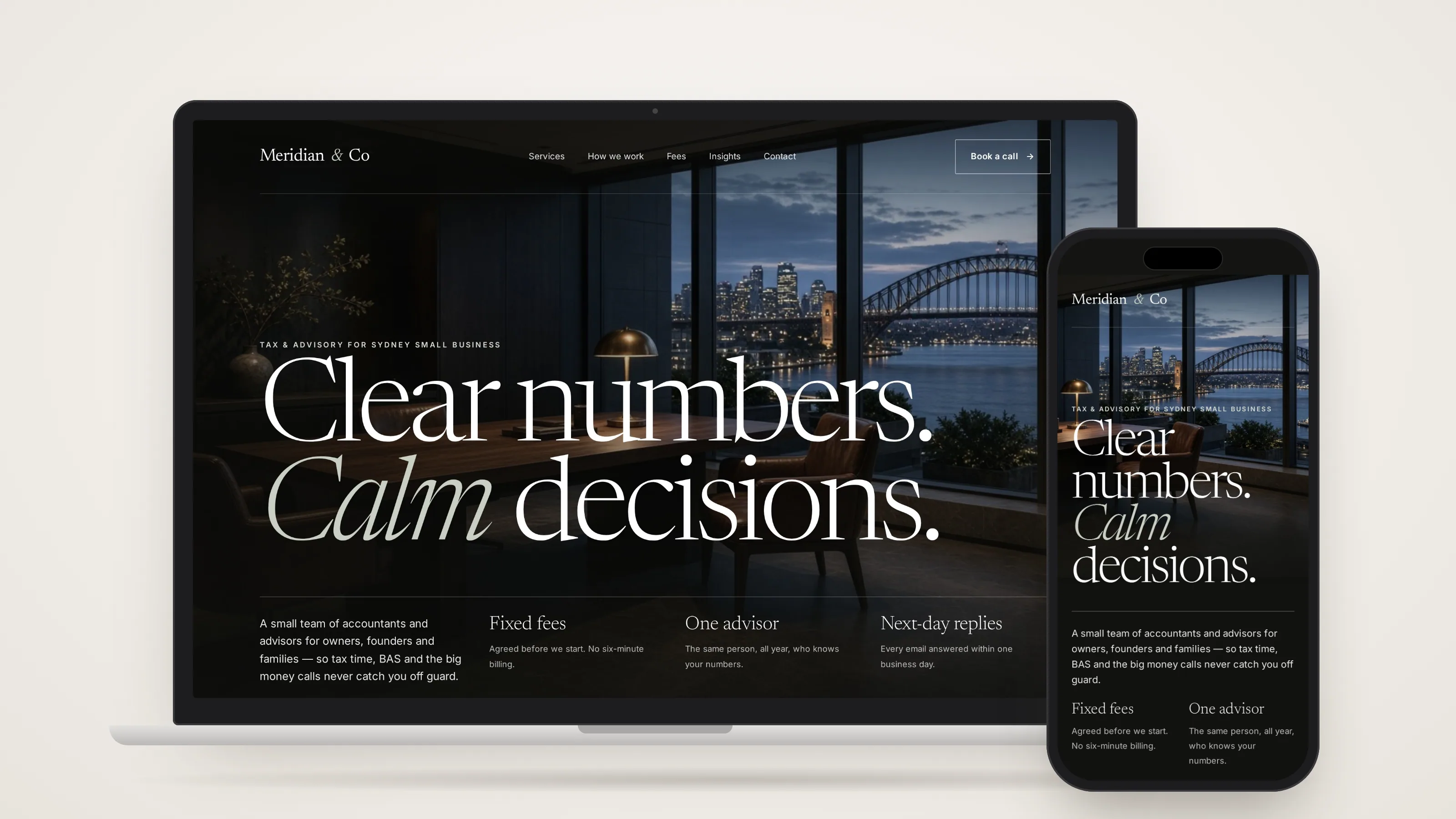
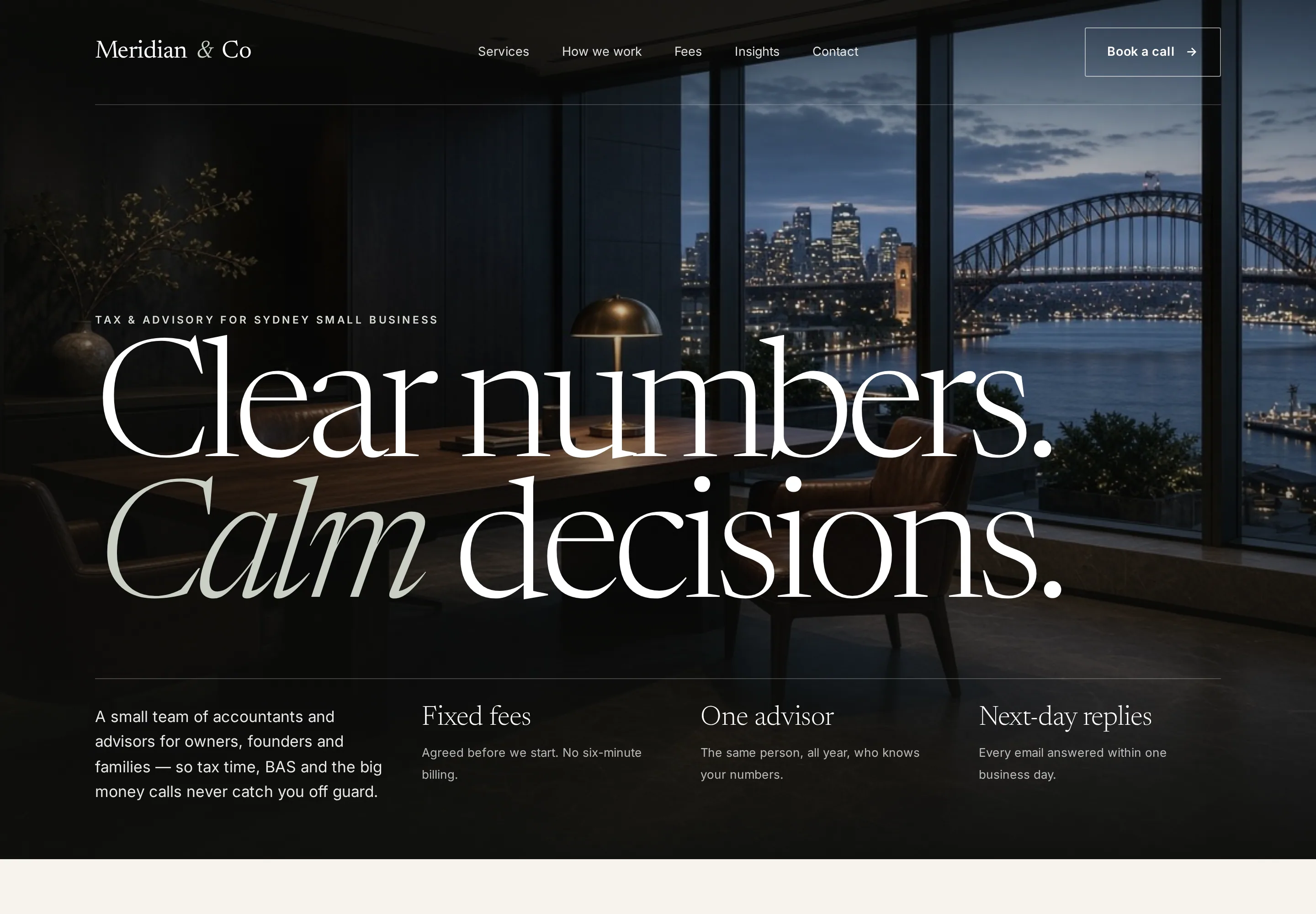
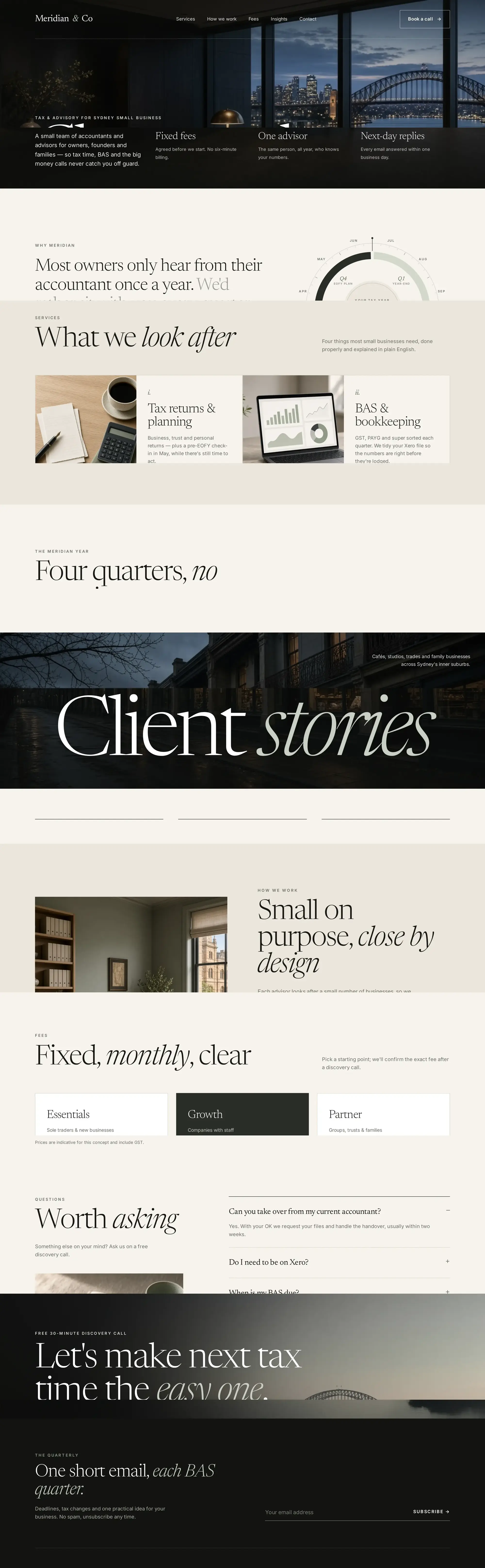
We opened on a dusk photograph of a sandstone office looking out to the Harbour Bridge, so the firm feels local and established before a word is read. An oversized serif headline sits right over the image to set a calm, confident tone. Three short promises underneath answer the first questions owners ask an accountant: fees, who they'll deal with and how fast they'll hear back.
Design concept
Show the fee before you ask for the books.
This is a design concept, not a client project. Meridian & Co is a fictional boutique accounting and tax advisory in Surry Hills, Sydney — the kind of small firm that looks after owners, founders and families all year, not only in June. We used it to show how accountant website design can lead with fixed fees, make BAS and EOFY timing obvious, and still feel like a local practice rather than a national template.
Nothing here is a live engagement. There are no client names, no invented results, and no quotes attributed to anyone. The page is a studio concept so we can walk through the decisions we would take on website design for accountants in Sydney.
What an accounting firm website needs
A small accounting or bookkeeping firm does not need a magazine. It needs a page that answers the questions owners already have in their head: what you do, what you charge, when you work through the year, and how to get a time in the diary. We would put that list on the brief for a website at the starting prices on plans, not leave it to a theme.
- Fixed fees, or a clear fee range, on the first screen — not after a contact form.
- Four services in plain English, with enough detail that a company, sole trader or family trust can see themselves.
- BAS and EOFY timing written as a calendar, not as a slogan about being proactive.
- A short path to book a call: one button, a next-day reply, no ten-field wall.
- Local Sydney cues — suburb, harbour, the way a Surry Hills firm actually talks — so the page could not sit in another city.
- A mobile layout that stays readable on a phone, which is where most of those enquiries start.
Why so many accounting sites lose the enquiry
Most accountant websites we are asked to replace do the same three things. They hide price. They list twelve services in identical boxes. They ask for a full set of books before anyone will talk. Owners bounce because they cannot tell whether the firm is for a café with a Xero file or a group of entities, and they will not send a BAS pack into a void.
The other failure is generic: a stock skyline, a handshake, and copy that could belong to any suburb. Website design for accountants in Sydney has to feel local without dressing up as a tourism ad. The concept opens on a dusk office looking out to the Harbour Bridge, then keeps the page quiet — stone, sage and charcoal, an editorial serif, still-life photography instead of stock smiles — so it looks like a practice that already has a room and a point of view.
Lead with fixed fees
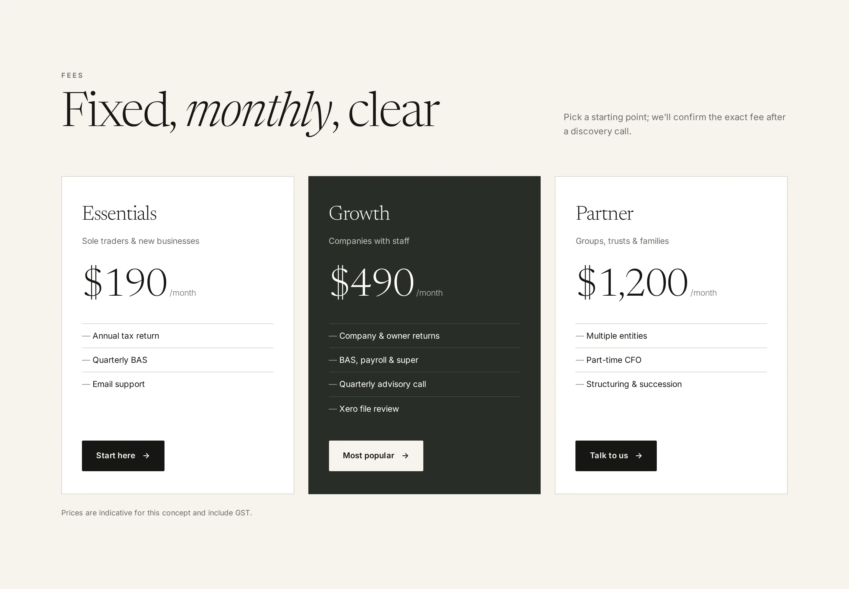
The first screen on the concept does not open with a mission. It opens with three promises: fixed fees, one advisor, next-day replies. Those are the questions owners ask before they care about brand story. If the fee is going to appear later, it should appear early enough that the rest of the page is read in good faith.
Further down, the concept puts three fixed monthly packages side by side — Essentials, Growth and Partner — so a visitor can find a fit in a few seconds. The middle card is darker because that is the plan most companies with staff would pick. A short note says the figures are indicative for the concept and include GST. Those package prices belong to the fictional firm. They are not WebXpert prices, and they are not a claim about what any real practice charges.
Showing fees is still the right pattern for most small firms. A site that only says “talk to us about a tailored proposal” trains people to shop on price in the inbox. A site that shows a monthly range, then offers a call for groups, trusts and anything messier, is being honest. That honesty is what we design for. The studio’s published starts are on plans.
Four services on one screen
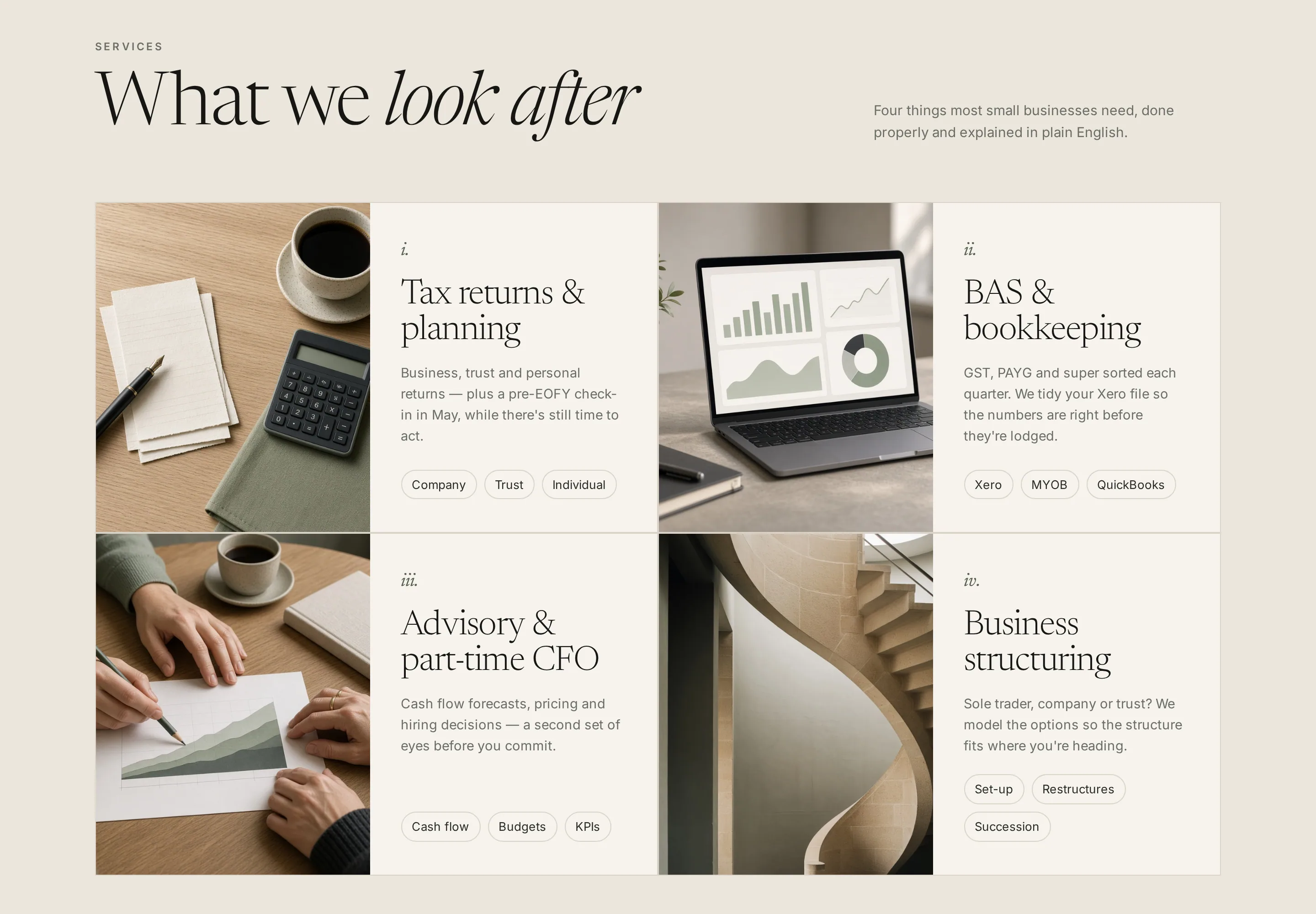
Accounting firm website design goes wrong when the offer is a long menu. Owners do not want to hunt. The concept lays out four services in a two-by-two grid: tax returns and planning, BAS and bookkeeping, advisory and part-time CFO, and business structuring. Each tile has a still-life photo, a numbered heading, a plain-English paragraph, and small tags for the entity types or software it covers — company, Xero, succession.
Four is enough. A fifth tile usually means the firm is listing every add-on it has ever invoiced. If you also do SMSF or audit, give that work its own page later. Tags do the quiet work: a sole trader on Xero can see themselves, and a family with a trust can see that structuring is in the room. We would write the tiles in the words the firm uses on the phone. “Proactive advisory” means nothing. “A mid-year forecast you will actually open” is closer.
BAS and EOFY, in plain words
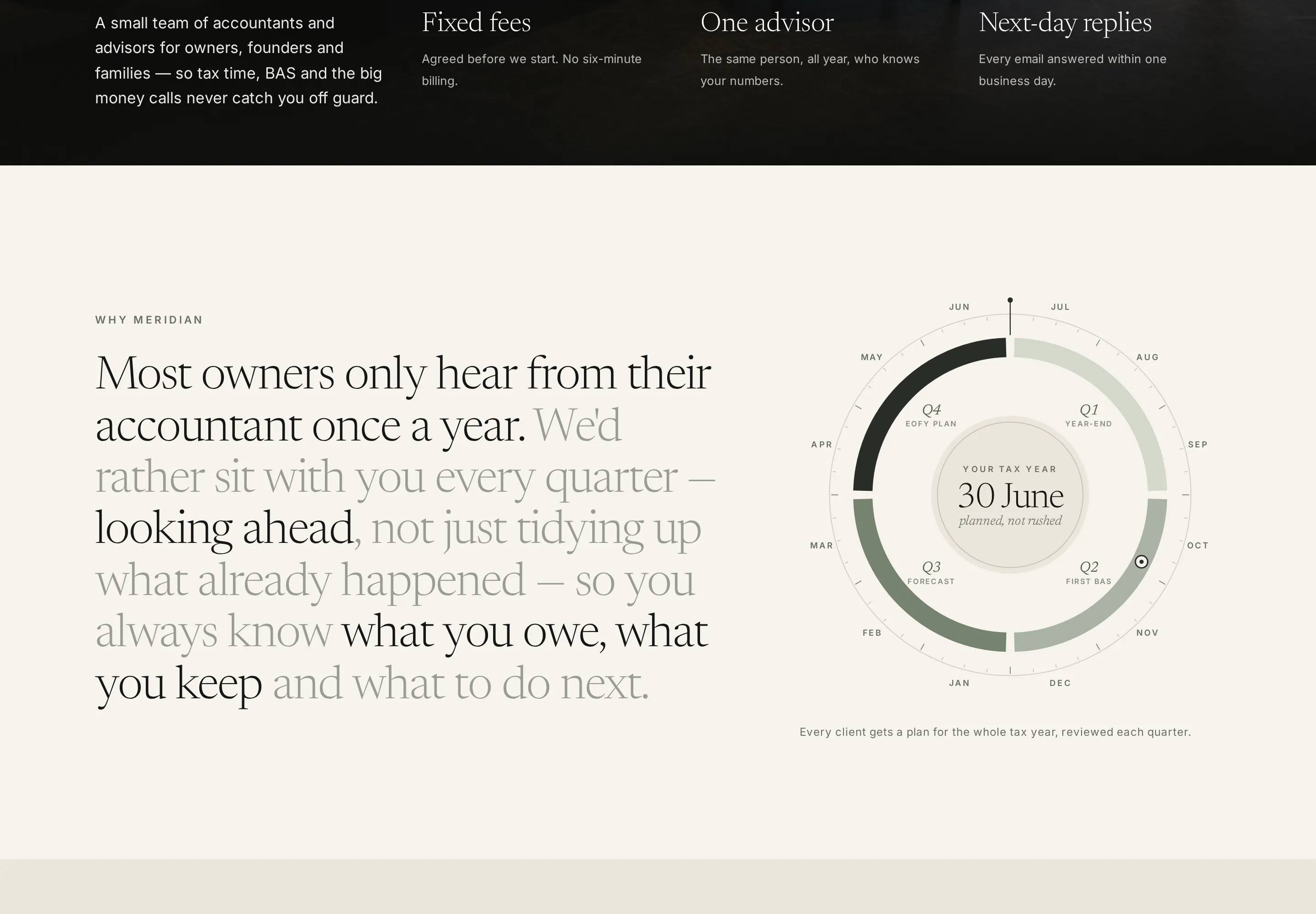
Year-round service is easy to claim and hard to show. The concept does it twice, on purpose. Beside a short editorial statement — most owners only hear from their accountant once a year — a circular dial maps July to June around 30 June. The four quarters are labelled in the words a client would use: close the year, first BAS, forecast, EOFY plan. The centre says the deadline is planned, not rushed.
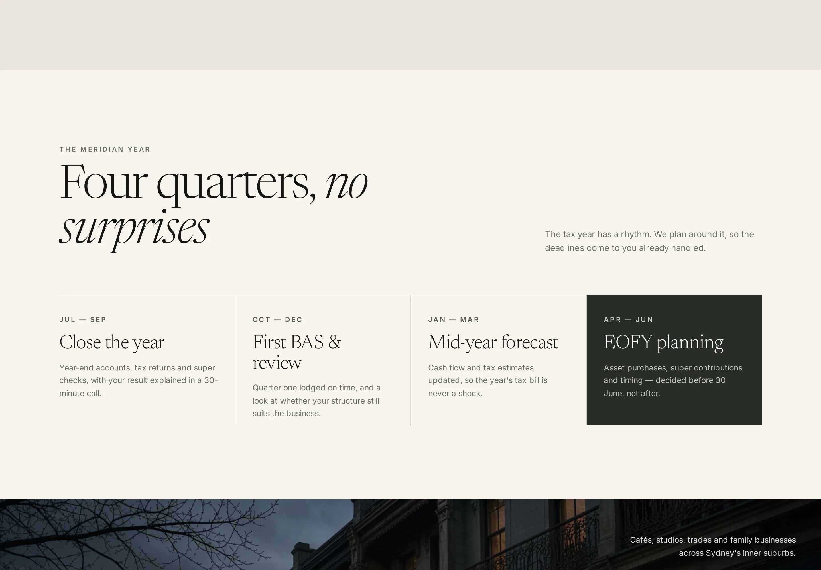
Then a second section turns the same idea into four cards on a timeline. July to September closes the year. October to December is the first BAS and a review. January to March is a mid-year forecast. April to June is EOFY planning, set on a dark card so the deadline is the one thing you cannot miss. Together, the dial and the cards do what a paragraph about “being with you all year” never does: they show the calendar.
That is the piece we would fight for on any website design for accountants in Sydney. BAS due dates and 30 June are not decoration. They are why someone is on the page in October, or in May. If the site cannot say what happens in each quarter, the firm still looks like a once-a-year lodgement shop — even if the work is better than that.
Make the next step a call, not a form wall
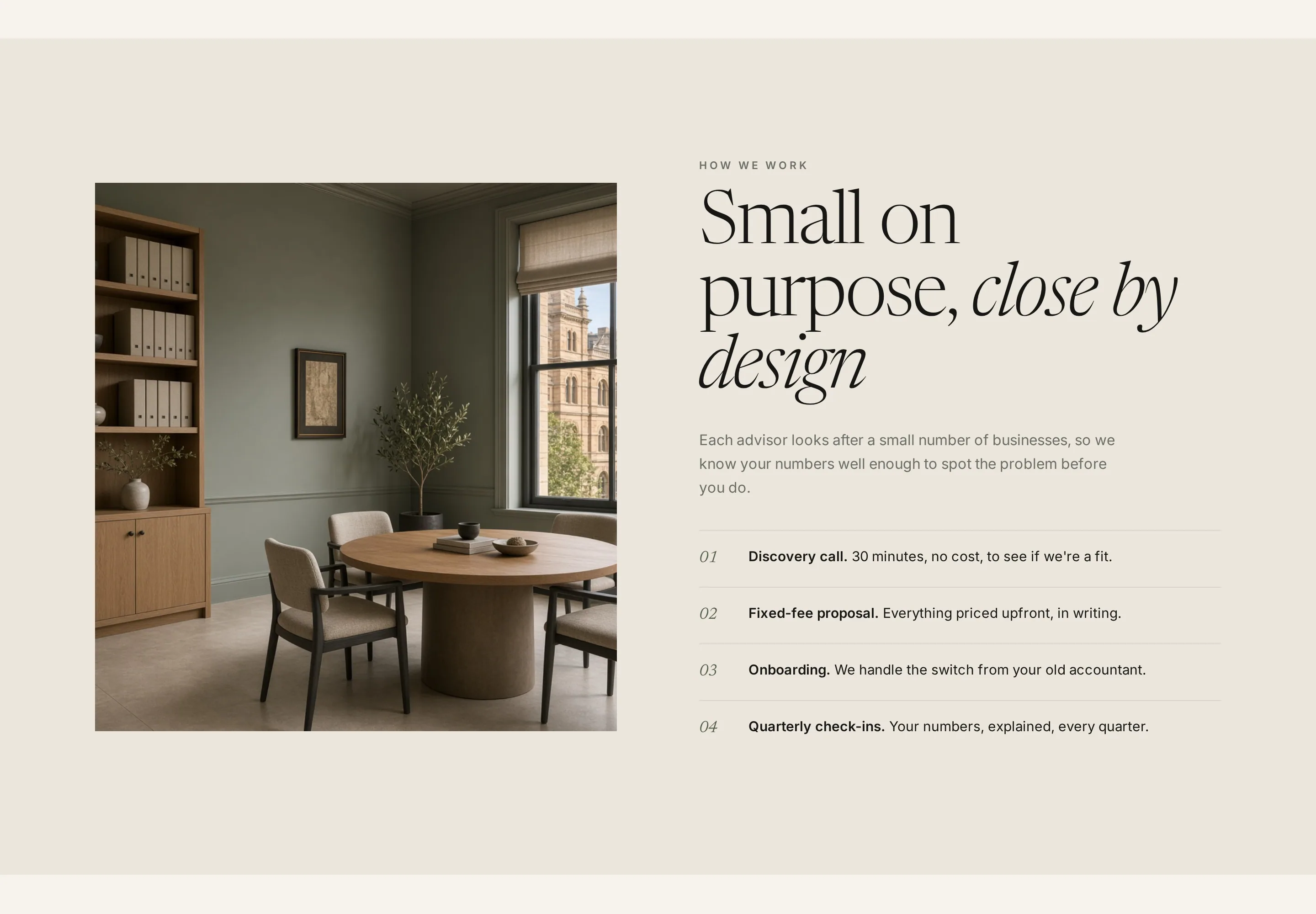
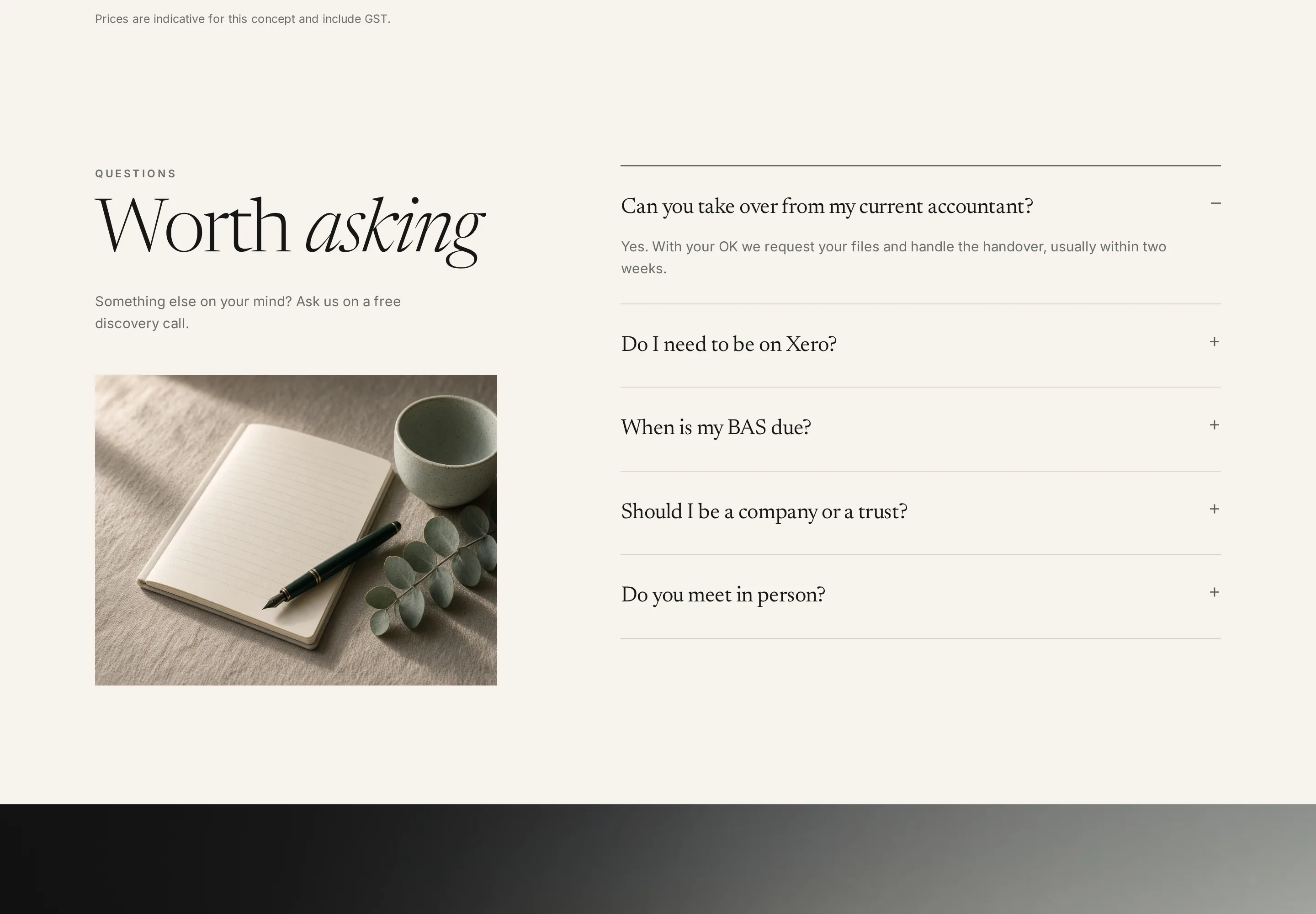
Switching accountants feels risky. The concept treats that as a design problem. A meeting-room photograph sits next to four numbered steps: a free discovery call, a fixed-fee proposal, onboarding, then quarterly check-ins. The heading is small on purpose, close by design. The steps make the switch look finite. No one is being asked to migrate a file before they have spoken to someone.
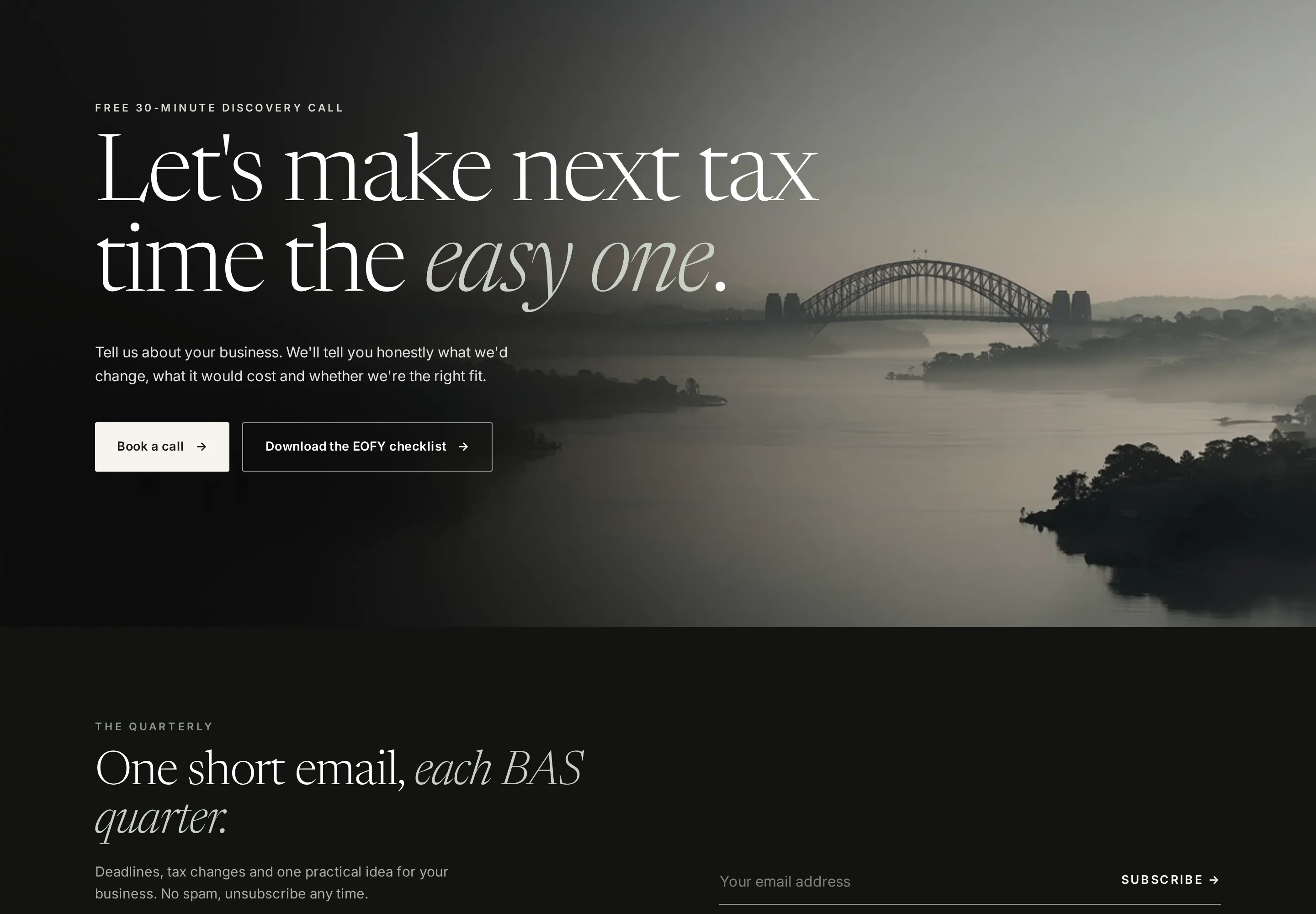
The close is a dawn view of the Harbour Bridge and a plain offer: a free thirty-minute discovery call, or an EOFY checklist if they are not ready to talk. Two buttons. That is enough. We would not put a ten-field “send us your last three BAS statements” form on a first visit. Book a call, promise a next-day reply, and keep the checklist as a useful second door. The same pattern works for bookkeeping firms and mixed practices: one human next step, visible on every key section.
Local Sydney cues, Google and AI answers
Local cues are not garnish. They are how SEO and GEO work for a practice that lives in one city. The concept uses Surry Hills, the Harbour Bridge, inner-suburban shopfronts, and Australian tax language — BAS, EOFY, Xero, company, trust — so the page is specific enough to cite. A template that could sit in Melbourne or Manchester will not be the page an assistant quotes when someone asks for an accountant in Sydney.
Owners do not search “accountant website design”. They search the suburb, the work, and the software. Put those words on the first screen, the service tiles, the quarter cards and the footer. Match the suburb and phone to the Google Business Profile. Write fees and timing in sentences, not only in pictures. We skipped the concept’s illustrative client-story band: invented bakeries with tidy metrics would teach the wrong lesson.
What this kind of website costs
A page like this is usually a compact marketing site: home, a little depth on services and fees, and a call path. WebXpert websites start from $999 for a typical build of about one to four pages, and a five-page site starts from $2,499. More than five pages, ecommerce and custom apps are quoted after a consultation. Care after launch is included on sites we build. Content is $1,200/mo (4 posts/month, 3-month minimum, monthly report). Ads management is $650/mo plus ad spend paid to Google. Those are the figures on plans. No other prices.
The concept shows the shape of the page. If the brief is website design for accountants in Sydney — fixed fees, four services, BAS and EOFY in plain words, and a call that is easy to book — that is the work we take.
Frequently asked questions
What should an accounting firm website include?
A first screen that names the firm, the work, and a way to book a call; four services written in plain English; BAS and EOFY timing so owners know what happens when; fees or a clear fee range; and local Sydney details that match how people search. That is the brief we take for website design for accountants, not a template with a stock skyline.
Should we show our fees on the website?
Yes, if you can stand behind them. Fixed monthly fees on the page answer the first question owners ask and cut the tyre-kickers who only wanted a cheap once-a-year return. Label ranges as GST-inclusive when they are, and keep a path to a call for groups, trusts and anything that needs a written quote.
How long does it take to build an accountant website?
Most marketing sites land in 1–4 weeks depending on scope. We lock the timeline in writing before the build starts. A typical one-to-four-page site is at the short end; a five-page site with services, fees and a booking path sits in the middle.
How does an accounting firm website get found in Google and AI answers?
Write the words owners actually search — accountant website design is a studio query; they search accountant Surry Hills, BAS agent, EOFY, Xero, company or trust. Put those facts on the page, keep the suburb and phone consistent with Google Business Profile, and give assistants something specific to cite. That is the SEO and GEO work, not a keyword stuffed in the footer.
How much does an accountant website cost?
WebXpert websites start from $999 for a typical build of about one to four pages, and a five-page site starts from $2,499. More than five pages, ecommerce and custom apps are quoted after a consultation. Care is included on WebXpert builds. Content: $1,200/mo (4 posts/month, 3-month minimum, monthly report). Ads management: $650/mo plus ad spend paid to Google.
View the full page
Next step
Like this direction for your brand?
Tell us about the project. We'll come back with a clear next step — usually within one business day.